The short answer
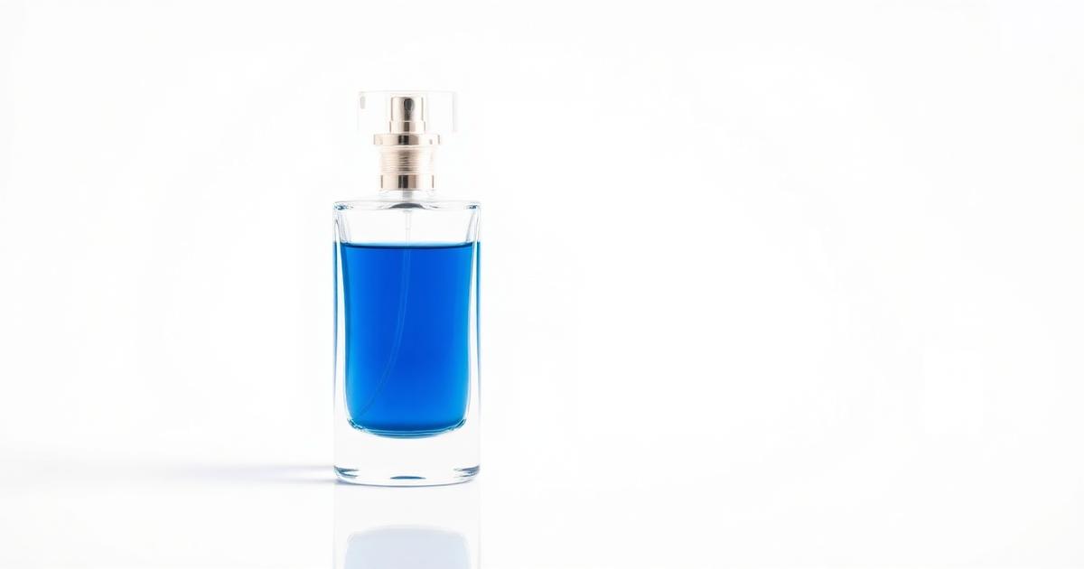
Capturing perfume bottles requires balancing transparency and reflection. The goal is to show the liquid color accurately while keeping the glass surfaces clean and the label sharp. AI simplifies this by allowing you to generate professional studio backgrounds and lighting environments around a basic photo of your bottle, ensuring it looks premium and trustworthy.
How to control reflections and refraction in glass?
A perfume bottle acts like a lens, bending light and reflecting the room. Without proper control, you end up with messy double reflections and a washed-out look.
- Diffused Lighting: Use a large, soft light source (like a window with a curtain) to avoid harsh spots on curved glass.
- Distance from Backdrop: Keep the bottle slightly away from the wall to prevent shadows from merging with the glass edges.
- Clean Every Surface: Dust and fingerprints are highly visible through liquid; clean the bottle thoroughly before shooting.
- AI Environment: Use AI to create clean studio lighting that highlights the bottle's shape without distracting glares.
How to keep the liquid color authentic?
The color of the perfume liquid communicates the scent profile (e.g., amber for oud, pale for citrus). If AI shifts this color, it misleads the buyer.
- Shoot in Daylight: Capture the original photo in neutral daylight to lock in the true liquid hue.
- Fixed Elements: When generating, specify that the liquid color must remain unchanged.
- Transparency: Ensure the AI maintains the 'see-through' quality of the glass and liquid.
- Brand Trust: Consistent color across all photos builds recognition and trust with repeat customers.
How to style perfume for luxury vs. everyday appeal?
The styling should match the price point and target audience of the fragrance.
| Style | Backgrounds | Ideal For |
|---|---|---|
| Luxury | Dark Marble, Silk | Oud, Niche, Evening Scents |
| Fresh | Pastels, Light Wood | Citrus, Floral, Day Scents |
| Modern | Abstract Shapes, Glass | Unisex, Minimalist Brands |
| Catalog | Plain White/Gradient | All Marketplace Listings |
Check our store image specs guide to ensure your final exports meet marketplace requirements.
How to ensure the label stays sharp and legible?
A blurry or distorted label makes a premium perfume look like a counterfeit product. Protection of the brand assets is non-negotiable.
- Logo Focus: Ensure the camera is focused directly on the label text in the source photo.
- Avoid Glare: Do not let a light reflection cross directly over the brand name.
- Resolution: Export in high resolution so that the text remains crisp even when zoomed in.
- Cross-Reference: See how to apply these rules to jewelry photography for similar reflective surfaces.
Frequently asked questions
Why does my perfume liquid look different in photos?
This is usually due to improper lighting or AI shifting the color temperature. Shoot in neutral daylight and treat the liquid color as a 'fixed' element during editing.
Should I shoot the cap separately?
Only if the cap is a very different material (like dark wood or shiny metal) that requires separate lighting. Usually, shooting them together is sufficient.
What is the best background for perfume ads?
Marble and satin fabrics are classic for luxury. For social media, using props like dried flowers or ingredients (e.g., vanilla beans) adds a lifestyle feel.