The short answer
AI product photography works by taking a standard photo of your product and using an AI studio like Vilabs360 to replace the background and lighting with a professional scene. The AI preserves the product's shape, color, and logo while placing it in a high-quality studio or lifestyle setting.
This technology allows you to create professional marketing visuals in minutes using only your smartphone, eliminating the need for expensive equipment or professional studios.
How to take the best source photo?
The quality of your AI output is directly linked to the quality of your input photo. A few minutes of preparation can save you dozens of failed attempts later.
- Place the product on a solid, neutral surface away from clutter.
- Use indirect window light instead of a harsh flash to preserve details.
- Clean the product of all fingerprints and dust before shooting.
- Shoot at the product's eye level to maintain natural proportions.
How to write effective AI prompts?
A precise description leads to a precise result. Instead of generic terms, specify the environment, lighting, and mood you want for your product.
- Define the background surface (e.g., 'light marble', 'dark wood', 'sandy beach').
- Specify lighting direction (e.g., 'soft side lighting', 'natural morning sun').
- Choose a color mood that fits your brand identity.
- Describe any secondary elements like water droplets or soft shadows.
What are the quality standards for publishing?
Never publish an AI-generated image without a final human check. Consistency is key to building customer trust and maintaining a professional store appearance.
- Ensure the color matches the real product perfectly to prevent returns.
- Check that the brand logo and text on the packaging are clear and legible.
- Verify that shadows and reflections follow a logical direction and light source.
- Confirm that the edges of the product are sharp and not blended into the background.
Which product categories benefit most?
While AI works for most products, certain categories see the highest return on investment due to the complexity of traditional photography in these fields.
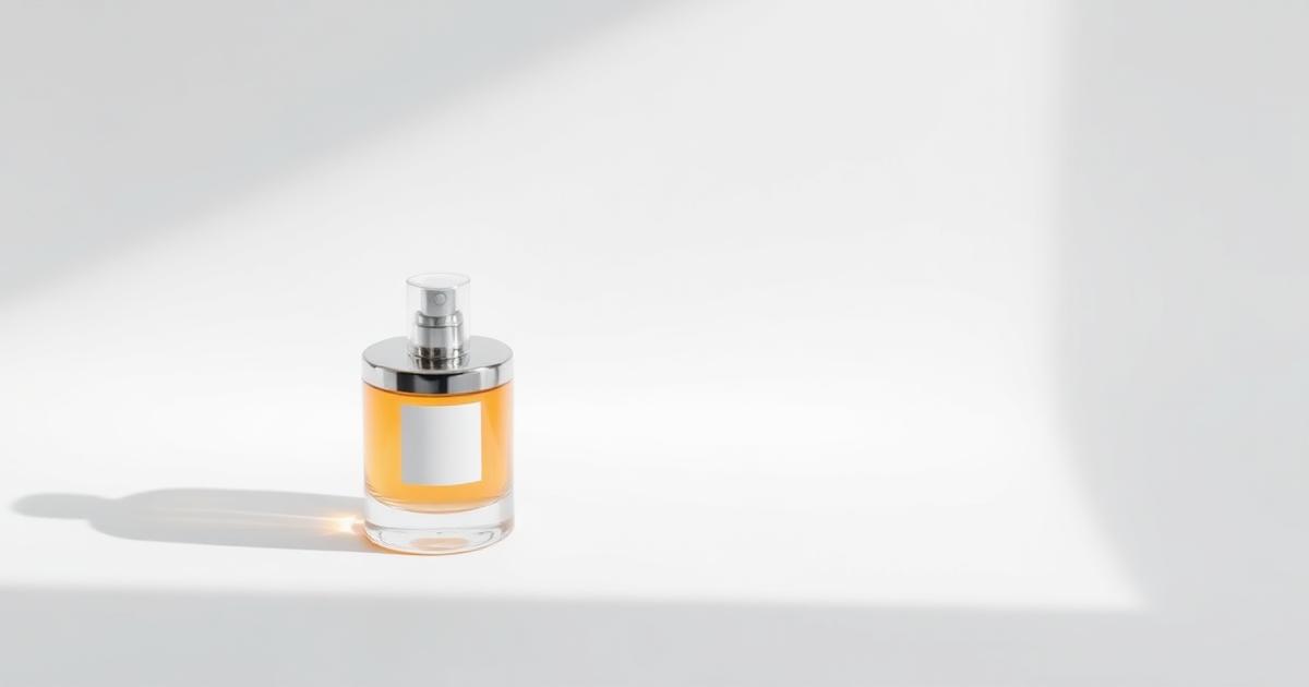
- Perfume & Glass: AI handles difficult reflections and lighting gradients perfectly.
- Cosmetics: Create clean, clinical studio shots or vibrant lifestyle scenes easily.
- Jewelry: Achieve a controlled sparkle without the glare of traditional lighting.
- Food: Add fresh details like steam or water droplets to make items look appetizing.
Frequently asked questions
Is a phone photo enough?
Yes, as long as it is clear, evenly lit, and shows the whole product. High resolution leads to better results.
Does the product color change?
The goal is to keep it the same. Always compare the final result with the real item before publishing.
How many images do I need per product?
We recommend 3 to 5 images: one main shot, one detail close-up, and one lifestyle context shot.